

Datawisp DevUpdates | June 2023 - User Obsession, Simplified Choices, Smart Blocks, RegEx
Here are some of the top DevUpdates for the month of June 2023 - Follow us on Twitter and LinkedIn for more DevUpdates!
Our mission is to make working with data as easy as writing an email, so we need to constantly obsess over the user experience - reducing complexity, simplifying choices, and making Datawisp more intuitive for users without a degree in data science. This month we launched UI experiments to do just that - refining our design approach at a more fundamental level.
Tldr: Although we will retain the horizontal, free-floating layout of Datawisp, almost everything else will undergo a transformation. With the promising performance in our user tests, we are highly confident that these changes will significantly improve the user experience.
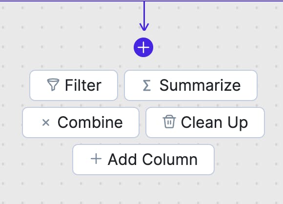
Simplified Choices
We’re going to drastically reduce the number of options when creating a new block, retaining only the primary tasks users might want to do with their data.

Our current menu has 53 options, which can be overwhelming for users. In user tests of the more simplified menu we observed testers more confident in what to do next. They were also noticeably more comfortable with experimenting - exactly how we want users to feel in Datawisp.
While the reduced options were helpful, it was crucial for us not to lose the functionality that Datawisp offers. We designed the experiment to retain all previous functionality, but presented to the user in a much simpler, more intuitive way.
Same Functionality with Smart Blocks
Our approach will be to make the blocks “smarter” and do more. Instead of overwhelming users with choices, we will offer relevant options based on context and remove impossible actions. For example, you can’t round text - that doesn’t make sense - but you can round a date!


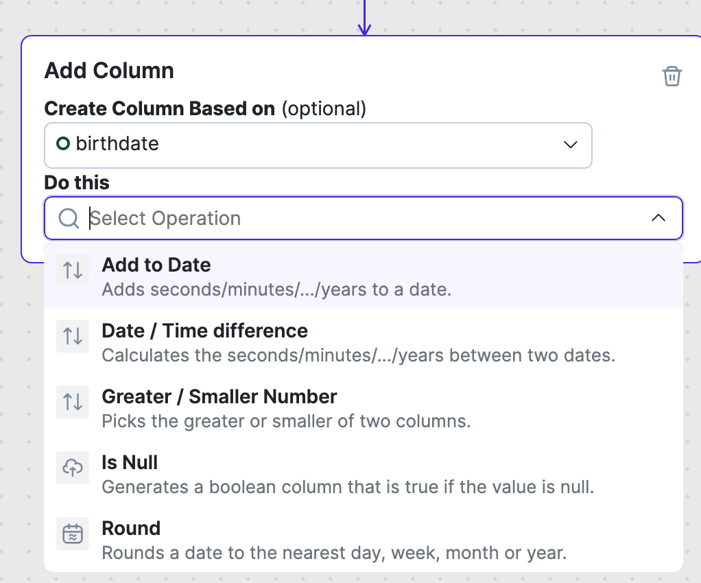
In user tests, our approach offered users a more sensible set of options, which greatly outperformed our old user interface.
Helpful Guidance
We always want a user to feel like they know what to do next, so we’re modifying the UI Element to a combo-box designed to show helpful documentation. In testing, we found that this UI encouraged users to read the descriptions, while these were sometimes overlooked in our old UI.


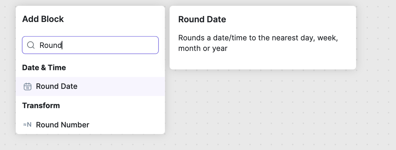
The documentation is exactly the same, but moving it closer to the button a user clicks made all the difference.
Staying The Same - Free Floating and Left to Right
We’re going to retain the principal feature of Datawisp - which allows users to freely move blocks around and arrange them in a left-to-right pattern.


While there were some noticeable benefits to a rigid, vertical user interface that we tested, users described using free floating as more satisfying - an aspect of the platform we did not want to compromise.
However, we’re going to incorporate the learnings from the vertical, rigid design we tested - reducing options, clear next steps, and helpful guidance where you need it.


Additional Improvements and Bugfixes
Not all of our efforts this month were directed towards UI experiments. We also made time for enhancements and bug fixes.
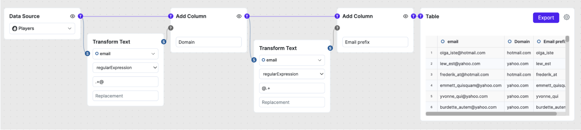
1. New Text Operations
You now can edit text with regular expressions. We think this feature will help users interact with text in new ways, and will be especially useful with our AI integrations!


2. Internal Improvements
We’ve improved several internals, especially around importing data. This will reduce the likelihood of bugs, make them easier to debug and fix, and improve performance.
3. Table Layout
We’ve improved how text and dates are displayed in Datawisp for a cleaner and more aligned look!


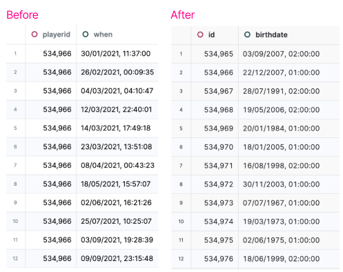
You can see how much the last digit of the date “jumps around” in the before picture, and how effortlessly neat the after picture looks.
This specific change has been made mainly because one of our devs was very very bothered by the old look, and couldn’t stand it - so he just fixed it himself.
Going forward
We’re committed to bringing all the improvements we found in testing to the product, and continuously making the experience as good as possible for new and existing users.
Thank you for your continued support and we look forward to sharing exciting updates with you again next month.
If you have any feedback, please reach out!